Creating a stunning perfume box design on screen is easy. Colours pop and everything looks amazing. But at our perfume design studio we always remind our design team ‘ The computer lies!’ Real world printing brings surprises. These 10 expert tips will help you to ensure that your perfume box design looks just as good in your hands as it does on your screen.
Colour Accuracy in Perfume Box Design
Screens use RGB colour, but offset printing uses CMYK. That glowing red or neon pink on your monitor may print duller in real life. Real life inks do not have a backlit effect to make them appear brighter. Always test your colours before committing.
Metallic Paper Challenges
Colours printed on metallic paper often appear one or two shades lighter than the Pantone chart shows. Pantone guides don’t show metallic results, so it takes trial and error.
Embossing tips for Perfume Box Design
Embossing reduces element size. A 2mm vector might look more like 1mm when it is embossed. Use thick lines for strong, defined emboss effects.
Handling Gradients
CMYK gradients are difficult to reproduce well on metallic surfaces, but not impossible. If your design uses soft transitions of colour, choose your printer carefully. Look at examples of what he/she has already achieved. Or maybe consider avoiding metallic finishes for the design.
Uncoated Paper Limitations
Uncoated paper soaks up ink like a thirsty drunk. Some printers cannot guarantee not to have small ink blemishes on the boxes. Stick to one or two solid colours for the best results.
Smart Pantone Choices
Some Pantone shades contain a lot of white ink. These will not achieve a metallic effect on metallic paper. Choose your colour carefully and check for percentage of white inside the colour.
CMYK versus Pantone in Perfume Box Design
CMYK prints in tiny dots with different colours layered on top of each other to achieve different colours. Pantone colours print as one solid colour. If you want rich, consistent colour, Pantone is the way to go. Some colours cannot be achieved in CMYK, they can appear less bright and cheerful.
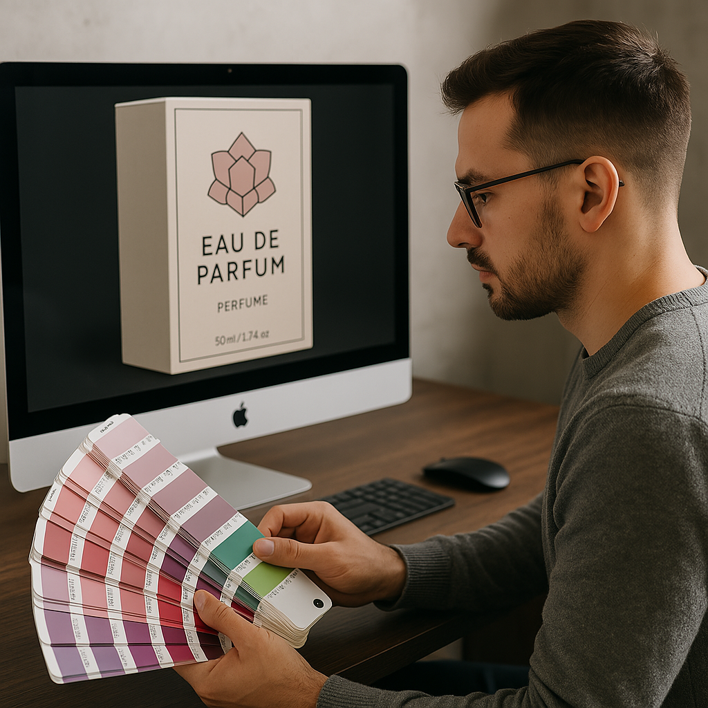
Why Every Perfume Box Designer Needs a Pantone Colour Bridge
The Pantone colour bridge shows side by side comparisons of CMYK and Pantone colours. It is essential for colour selection and to manage print expectations.
Using Textured Paper in Perfume Box Design
Textured paper adds flair to a box design, but limits your printing options. Only use hot foil for text or patterns. Avoid deep textured papers if your box needs barcodes or fine print. Hot foil does not perform well on highly textured surfaces. Some limited screen printing is possible, but offset printing is not possible.
How 3D Embossing can enhance your Design
Want to stand out on the shelves? Invest in 3D embossing. It costs more, but it adds a luxurious, high end feel that catches the eye and screams luxury.
Conclusions: A Perfect Perfume Box Design Starts with Smart Decisions
A beautiful perfume box design doesn’t happen by accident. It’s the result of thoughtful choices, expert knowledge and attention to detail. From choosing the right paper, to mastering colour management and embossing effects, every decision matters. Want your next project to wow clients and stand out on the shelf? Start with these 10 tips and never trust your screen again! For more tips on print design check out a good printing blog’s list of common printing mistakes.
Our team of trained perfume packaging designers know which materials give the best results and how to achieve the best printing results. For expert help please get in touch with us to assist you.